Know Your Print Basics
At JnK, we’d like to ensure you have the know-how to create high-quality print files to cut down on time and even cost. Understanding the following print basics will help you deliver print-ready files.
Size & Specifcations
Be aware of print dimensions. Sometimes it helps to use a standard size. (Ask us for standard sizes if you aren’t sure what to use).
Template files are also helpful in setting up your design, especially for jobs that fold or use a special trim. We can supply templates for most standard print jobs by emailing graphics@jnkservices.com.
Color Mode – CMYK vs. RGB
How you set up your print file colors is VERY important! This includes logos supplied to us for file setup.
CMYK is an ink-based color mode which is used in PRINT design.
RGB is a light-based color mode used in WEB design.

It’s important to note that RGB does allow for some brighter colors on screen, BUT these colors will not translate to print. Because of this, you should always create your print files in CMYK color mode first, not RGB. Some types of design, like logos, are used in both print and web. These will need to have both a CMYK and RGB version.
Vector vs. Raster
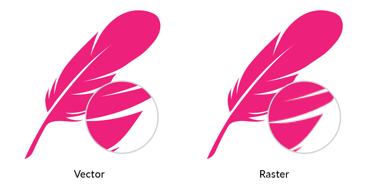
We will sometimes ask for a vector copy of images, especially logos.
Vector images:
- Usually designed using Adobe Illustrator
- Made up of basic geometric shapes such as points, lines and curves
- Can be scaled up or down without losing quality
Raster images usually refer to photos, but also include any flattened images. These cannot be scaled up without losing quality, which means you should always avoid rasterizing your logo, or including raster in your logo.
Raster images:
- Usually created in software like Photoshop
- Made up of a set grid of dots called pixels where each pixel is assigned a color value
- Unlike a vector image, raster images are resolution dependent
- When you change the size of a raster image, you shrink or stretch the pixels which can result in a significant loss of clarity and a very blurry/pixelated image.

Resolution
Resolution refers to the amount of pixel detail in an image.
Low Resolution:
A lower amount of pixels mean the image will appear pixelated. (The WEB standard is 72dpi)
High Resolution:
A large amount of pixels will make a sharper/cleaner image. (The PRINT standard is 300dpi)

When using raster images in your print design, make sure to use High Resolution images.
Print Guidelines
Use these guidelines to ensure print-ready designs:

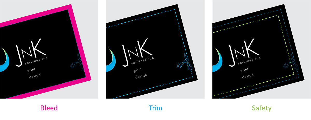
Bleed: The area beyond where the piece will be trimmed.
(Most printers require a minimum of 1/8″)
Trim: If your design bleeds, it will need to be trimmed down to the final size.
Safety It is important to keep your text & art that you do not intend to bleed within a safety margin. Non bleeding images should be at least 1/8″ from the trim. Text can be 1/8″ on small pieces such as business cards, but a larger margin of at least 1/4″ should be used on larger pieces such as postcards, flyers, brochures, etc.
